Brand Design
Software I’ve worked with:Software I'm getting more comfortable with:A brand is how people feel about you before they've met you. I help small businesses figure out what that feeling should be, then build it into everything: the logo, the website, the words, and the signs on the truck. I write the copy as well as design it, so the brand looks and sounds like the same company.
*Accessibility checks
Welcome Home
Inspections & Testing
Project No. 1Overview
Welcome Home Inspections & Testing (WHIT) is a home inspection and radon testing company in Vermont. I built the brand from the ground up: the identity, the website, the copy, and the print and signage that bring it into the real world.
Challenge
Home inspection is technical, and the stakes are high. Buyers are making one of the biggest purchases of their lives, and they need to trust the person checking the house. Most inspection brands lean clinical. WHIT needed to feel warm and human without losing credibility. The website also had to serve two audiences at once: homebuyers looking for an inspector, and real estate agents referring their clients.
Approach
The name led the way. Every inspection is the start of someone feeling at home in a new place, so the brand is built around that moment: safety, comfort, and confidence on day one. "WHIT" gave the company a short everyday name and a tagline: Inspect with WHIT.
Identity: A clean, friendly wordmark that feels more like a local business than an inspection firm.
Photography: Portraits of founder Christian, so clients see a real face before they book.
Voice: Copy that sounds like a knowledgeable neighbor, not a legal disclaimer. I organized the messaging around an "Our Values, Your Keys" framework that pairs each value with something the client gets:
Expediency → reports in 24 hours, so decisions don't wait
Confidentiality → your report, your call on who sees it
Thoroughness → the details tell the full story of the home
Partnership → support through closing and beyond
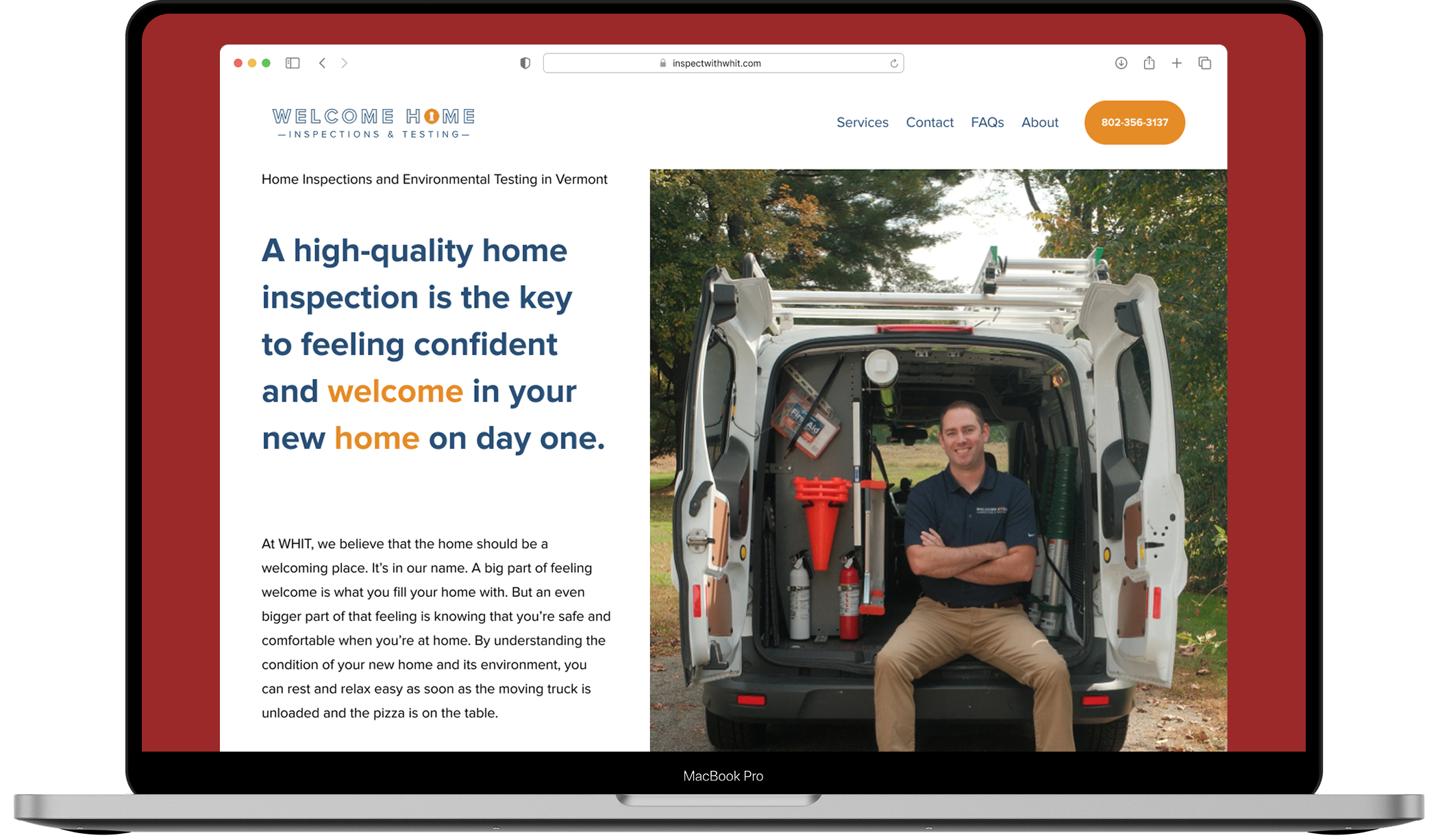
Website: A calm, uncluttered layout with clear pages for each service (home, septic, sewer scope, radon, water, and WDI) and quick paths to booking. Credentials like the state license, NRPP radon certification, and ASHI/AHIT training are easy to find, but they don't bury the reader.
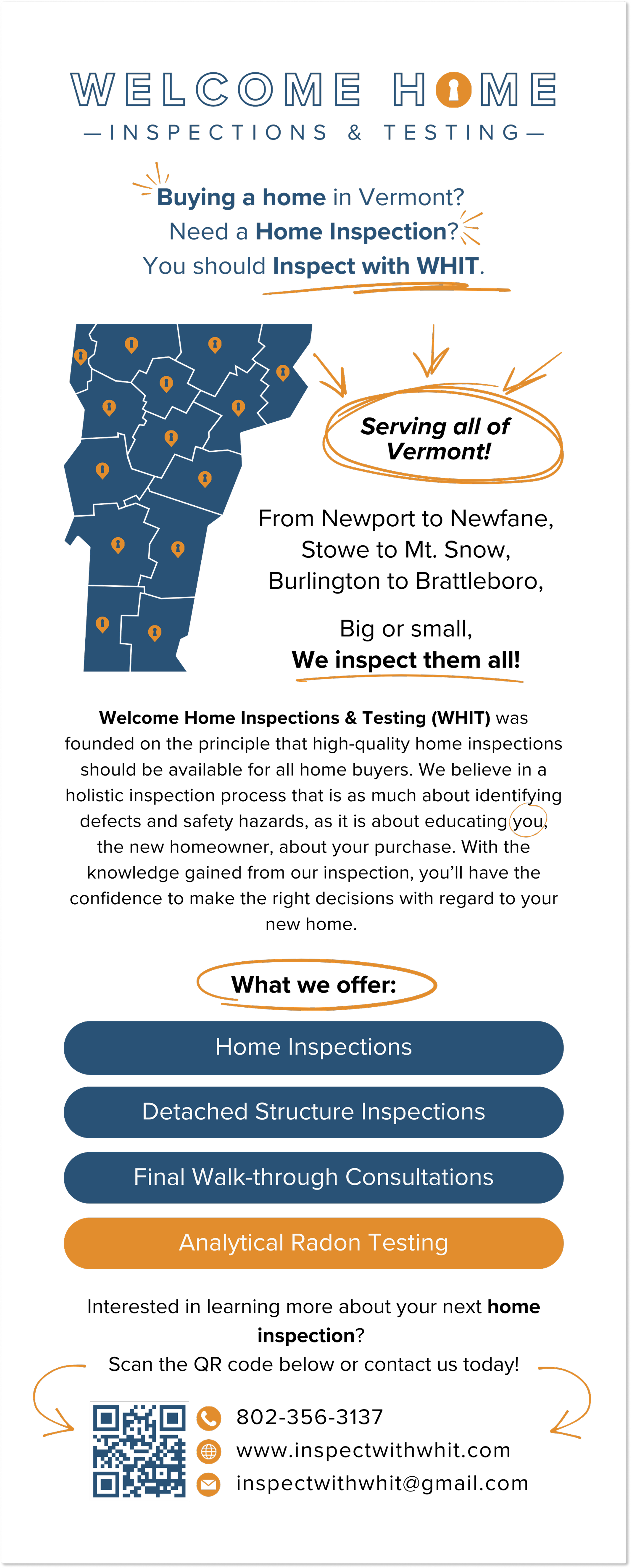
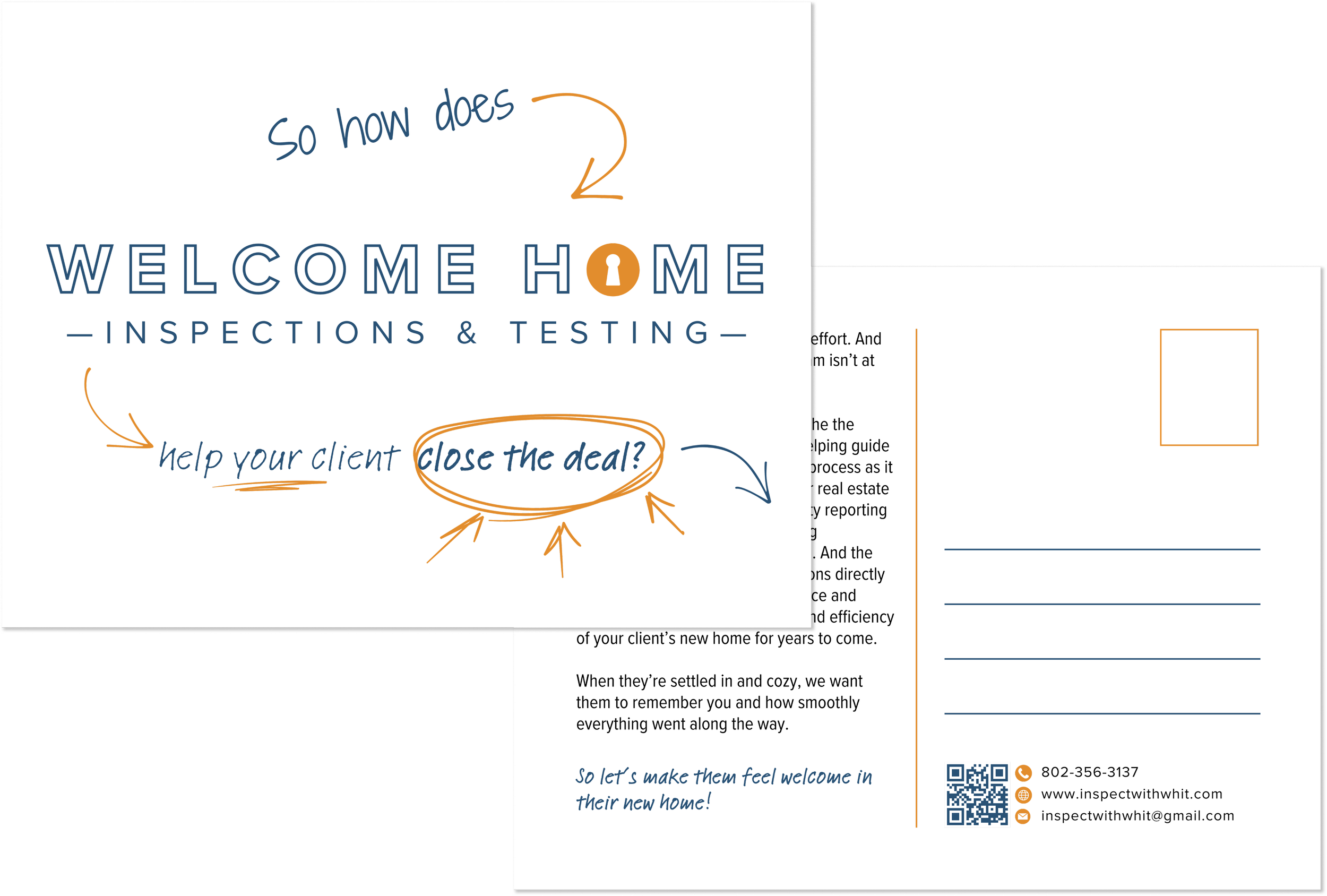
Print and signage: The same look and voice carried into signage, merchandise, and printed materials.
Outcome
The website does real work for the business. Half of WHIT's bookings now come through the site's contact form. The site has also made WHIT easy to find, both in regular web searches and in AI search tools, where people increasingly look for local services.
The brand stays the same across the website, print, and signage, and it's built around one feeling: a good inspection is what lets you finally relax into a new home. The values framework does two jobs. It sets WHIT apart on the specifics, and it turns every feature into something the client gains.
Visit the site at inspectwithwhit.com.